Posts

Showing posts from March, 2020

3rd Quarter Submission

Image
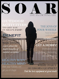
COVER I revised many things to make the cover more cohesive and like a real magazine cover. Before it felt like there was no text and it was too bare compared to many other magazines similar to it. I took ideas from other magazines and added more articles to fill the front page, they all follow around the silhouette of the figure in the middle bringing attention to that spot as the text flows around it. The different colors added to text stay in the aesthetic of the page, they are mainly blue, black and white so that they match the background. The text and fonts are easy to read and add to the looks of the cover. Some bold words are eye catching and I specially picked words I thought would be the main topics and that would be interesting. The appearance of  the cover is much better than my original because I gathered more information from that point to make it more realistically like a magazine. TABLE OF CONTENTS The table of contents was a struggle, revising took a long ti

Revision #3

Image
PAGE REVISIONS We had to do two pages and there were a lot of things I definitely wanted to change to make the overall pages cleaner and match the aesthetic I wanted. I switched from Publisher into Indesign to make my two pages. What I did when going into the first page was revise my fonts and layout, before I thought it didn't look as professional so I wanted to change that. Also photos are placed with more meaning and relate to the overall topic being discussed in the article. I wanted to make it look more realistically like a magazine page so I aligned my text in a way that many of the examples I looked at do. Dividers are placed to separate the top from the beginning of the article and the writing. Page numbers are placed by photos that relate to another page, like the rollerskating photo had its page number where you learn more information about it. I again stuck to my bordered pages because I think it matches the aesthetic i'm going for and helps to fill all the white

Revision #2

Image
TABLE OF CONTENTS REVISED I knew I wanted to change up my table of contents to make it more audience friendly and I found a better way to sort it. The original layout did not have all the page numbers, only the main ones, so I wanted to offer in the contents all the page numbers and articles. I'm glad I made the main sections like Introduction, Rollerskating, Rollerblading, and Long-boarding bold and larger than the others because the articles and page numbers under them are part of the category. I changed the photos on the front to be more aesthetic to match one another and give content into the material. Also, making the background a gray color instead of white helps to tone down the brightness and makes the contents overall easier to read. The boarder on the table of contents was added to match the cover page as it follows the consistency.  There is a divider between the numbers and articles to make reading easier and cleaner. And a divider separating the top photo and the te