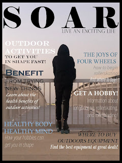
3rd Quarter Submission
COVER
I revised many things to make the cover more cohesive and like a real magazine cover. Before it felt like there was no text and it was too bare compared to many other magazines similar to it. I took ideas from other magazines and added more articles to fill the front page, they all follow around the silhouette of the figure in the middle bringing attention to that spot as the text flows around it. The different colors added to text stay in the aesthetic of the page, they are mainly blue, black and white so that they match the background. The text and fonts are easy to read and add to the looks of the cover. Some bold words are eye catching and I specially picked words I thought would be the main topics and that would be interesting. The appearance of the cover is much better than my original because I gathered more information from that point to make it more realistically like a magazine.
TABLE OF CONTENTS
The table of contents was a struggle, revising took a long time because I needed to make sure all my pages numbers and articles were right. My original contents did not have all the articles and their pages, as to cut down on an eye-full of words and numbers. But I've sectioned off the main articles and their page numbers, and under them the pages that follow the topics. The bigger numbers and bold font allow the reader to see them first and what follow are the smaller numbers/font. I think this way of organization allows the reader to find out which topic they want to check out first, and if looking for a specific article, they can look at the smaller page numbers to find it. My pictures are sort of relating to the same outdoor activity but has bright colors that I though would be nice to see when you would open to the first page. The design of the contents was mainly based on the magazines I saw where they made a clean and right to the point context that was easy to get through and has matching visuals. I like this layout a lot more and will plan to do a similar one on the final.
PAGES
I revised a lot of the things in my pages to make them better and more likely to go with my magazine. The revisions consisted of changing from publisher to Indesign, adding boarders to my pages, adding numbers to the pages and photos in them, and other small changes. The photos have a better placement in the article to where they do not crowd too much, but also show off my photography. My use of fonts more represents a magazine now and I tried to add titles to where I talk about a specific outdoor activity. The titles consists of Rollerskating, Rollerblading, and Longboarding as they are a different font from the main body of text. The sorting of text worked to my advantage and gave me a cleaner layout that is easy to navigate and read. I observed similar magazine pages and they would follow similar patterns of sorting, a title, a description, then the body of the article. This is a layout i'll probably use in my final magazine outcome.


Comments
Post a Comment