Posts

Showing posts from 2020

Final Submission

Image
FINAL SUBMISSION (Due to not having the right technology/editing software at home during  COVID-19 I was not able to apply my final revisions to my magazine project, but here is what I would have done.) My computer couldn't run the software I needed to be able to make the revisions, also my data for all the parts of the magazine project were on my schools computer. I couldn't access any of the files to be able to load them and revise accordingly. My computer isn't the most efficient and can't run a lot of things, like Photoshop which I needed to run to revise my cover. I tried to find a way to get the files on my computer but in the end nothing worked and I didn't want to restart all my magazine pages from scratch.  COVER: For my cover I would have organized my text a bit more, possibly adding different fonts or more colors to increase my use of space on the cover. Magazines like to use as much space to get their point across as possible, and I would have

Critical Creative Reflection Prezi

SOAR Magazine Project Prezi

CCR Question #4 Draft

CCR Question #4 4. How did you incorporate technology in the process? I started working on my magazine by making layouts for my pages and cover and when I did this I used a lot of different software. I started by using Adobe Publisher and writing my drafts on Microsoft word, I later shifted entirely over to Adobe InDesign. The reason for this switch was that Publisher didn't have all the settings I wanted and InDesign ended up being easier to navigate and produce a better outcome. I took my photos using my iPhone camera at its highest settings and it worked well for what I needed. And when I finally got them online to edit I used mainly Photoshop. I used Photoshop to reshape photos, add borders, fix colors, add text, and put together my whole cover. I was able to easily navigate Photoshop due to my past experience with it, I took a whole class on how to work and edit on Photoshop. I used my past knowledge and gathered new knowledge to edit my photos the way I wanted. I was a

CCR Question #3 Draft

CCR Question #3 3.  How did your production skills develop throughout the process? At first it was sort of difficult and overwhelming. But as I started to plan things out the project seemed more organized and I was able to develop things the way I wanted. When starting the production of this project I had to figure out exactly what I was trying to produce. I settled on a topic which I was knowledgeable in, which was outdoor hobbies/activities. I knew that going outdoors and trying something knew was fun and beneficial, and I wanted to demonstrate that in my project. So knowing what my goal was I went to a location that revolved around outdoors. Benderson Park was the location I really wanted to get some shots at for the magazine. But there were some complications with the model being able to meet up at the desired location. For a few of my photos I had the model use some of the outdoor equipment down the street near my house. It had good scenery, but it didn't have the sam

CCR Question #2 Draft

CCR Question #2 2. How does your product engage with audiences and how would it be distributed as a real media text? My magazine audience is similar to many of the other magazines I've examined. My magazines audience would be a range of ages with it mainly being from 10-50+ as the magazine has a focus on health and has to be of basic knowledge to understand. With this, the gender could be either depending on what they have an interest in. In my magazine some of the outdoors activities covered are longboarding, rollerskating, and rollerblading so mainly inclusive activities. The target audience would be those interested in the topic, which is outdoors and outdoors activities/hobbies. Some of the magazines I drew inspiration from with similar audience would be Racquet, Outdoors, and Huck. Racquet was one of the main ones I leaned toward. Their magazine is new and polished and as an updated magazine it brings in a new audience. It offers creativity and clever ideas to show it

CCR Question #1 Draft

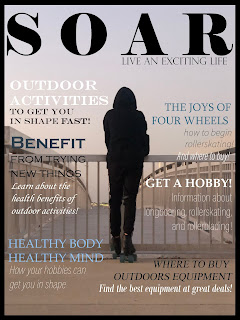
CCR Question #1 Draft 1. How does your product use or challenge conventions and how does it represent social groups or issues? In my project I used a few conventions to help convey my topic and message. My genre was outdoors activities/hobbies so I wanted to give clearly show that with my camera shots, fonts, and colors. My cover was a wide-shot of a figure in black standing in the foreground with a bridge and blue sky in the background. I used this shot for the cover because the figure pops with black on the soft background making it stand out and your eye goes to the figure right away. Also, the model is wearing skates representing my outdoors activities. But most importantly, the model is looking forward to somewhere far away, and the bridge projecting forward represents the journey and the longing to go out there and move forward into the unknown. I wanted this to show that the possibilities are endless with the outdoors, there are adventures waiting and a whole world worth

3rd Quarter Submission

Image
COVER I revised many things to make the cover more cohesive and like a real magazine cover. Before it felt like there was no text and it was too bare compared to many other magazines similar to it. I took ideas from other magazines and added more articles to fill the front page, they all follow around the silhouette of the figure in the middle bringing attention to that spot as the text flows around it. The different colors added to text stay in the aesthetic of the page, they are mainly blue, black and white so that they match the background. The text and fonts are easy to read and add to the looks of the cover. Some bold words are eye catching and I specially picked words I thought would be the main topics and that would be interesting. The appearance of  the cover is much better than my original because I gathered more information from that point to make it more realistically like a magazine. TABLE OF CONTENTS The table of contents was a struggle, revising took a long ti

Revision #3

Image
PAGE REVISIONS We had to do two pages and there were a lot of things I definitely wanted to change to make the overall pages cleaner and match the aesthetic I wanted. I switched from Publisher into Indesign to make my two pages. What I did when going into the first page was revise my fonts and layout, before I thought it didn't look as professional so I wanted to change that. Also photos are placed with more meaning and relate to the overall topic being discussed in the article. I wanted to make it look more realistically like a magazine page so I aligned my text in a way that many of the examples I looked at do. Dividers are placed to separate the top from the beginning of the article and the writing. Page numbers are placed by photos that relate to another page, like the rollerskating photo had its page number where you learn more information about it. I again stuck to my bordered pages because I think it matches the aesthetic i'm going for and helps to fill all the white

Revision #2

Image
TABLE OF CONTENTS REVISED I knew I wanted to change up my table of contents to make it more audience friendly and I found a better way to sort it. The original layout did not have all the page numbers, only the main ones, so I wanted to offer in the contents all the page numbers and articles. I'm glad I made the main sections like Introduction, Rollerskating, Rollerblading, and Long-boarding bold and larger than the others because the articles and page numbers under them are part of the category. I changed the photos on the front to be more aesthetic to match one another and give content into the material. Also, making the background a gray color instead of white helps to tone down the brightness and makes the contents overall easier to read. The boarder on the table of contents was added to match the cover page as it follows the consistency.  There is a divider between the numbers and articles to make reading easier and cleaner. And a divider separating the top photo and the te

Distribution Plan

DISTRIBUTION PLAN STANDARD DISTRIBUTION MODEL A distribution plan I would use would be physical copies of my magazine. There are many ways I could produce and advertise this. An idea would be having physical copies that could be distributed to stores that have a relation with my magazine and the products inside it. Since my magazine is outdoors activities i'd say it could be distributed mainly to sports stores possibly Dick's Sporting Goods and such. Anywhere where the magazine can be see whether it be a magazine rack, but a relation to the location and magazine can be vital. Also I believe i'd want to run the magazine independently, possibly with a trusted team and maybe sponsorship. Running the production would be me and a worker/partner and i'd hire a team of editors and distribution managers who can work with sponsors who share the same relation to the magazine and its products. The reason i'd want to run it as a sort of inside team is mainly because I

Distribution Research - Another Escape

Image
 ANOTHER ESCAPE MAGAZINE Another Escape is an outdoors magazine that focuses on nature and living life passionately and enjoying the world. Many of its articles consist of topics under the genre of outdoors and their creativity and inspiring articles bring in an audience who share the same traits. They are an independent distribution magazine like many others starting out where they mainly produce and manage their magazine on their own. This way of distribution allows the magazine to expand when-ever it wants and decide what they want to do without approval. They have a few ways of distributing with others, for instance through sponsorship with brands or other articles relating to their magazine. The magazine sponsors articles from other magazines on their website and the magazine whom they sponsored does the same on their website. That leads us into how they use the internet to distribute their magazines. Whether it be by purchasing the magazine online or just connecting with the

Distribution Research - Caddie

Image
CADDIE MAGAZINE Caddie is a magazine that mainly revolves around the sport of golf, its players, and supplies. It embraces the outdoor experience of golf and is mainly an outdoors/sports genre magazine. It uses some tactics in its distribution plan like being involved in many ways of distribution. They selectively distribute to their audience, mainly those of a probable older age group who play the sport golf. This way of distributing allows the magazine to get straight to the people who are sure to purchase and support the magazine. Though not using the exclusive marketing of being involved with multiple topics it may be closed off to a few people. But other than that they can still bring in new and returning audience with their specialized selective ways by reaching the right people directly. Another way they distribute well is making sure their magazine is keeping up with its competitors. Other sports, or golf, magazines are always updating their articles and websites to meet t

Traditional Distribution

TRADITIONAL DISTRIBUTION MAGAZINES Magazines work through many different ways of distribution, mainly in a model of listening, understanding, and adjusting. When it comes to who runs this distribution, it can be many different people working in sync. There can be people as producers, wholesalers, and retailers. Each part of the process is important in getting the magazine running and gaining audience. A few ways that magazines use the distribution model can be if there is a direct distribution with a magazine producing with its own salespeople and warehouses.  Other than that, there is a way to distribute where you have a manufacturer or a shared partner that helps produce with you. Then as the magazine is produced retailers can market the product by means of physical copies or online subscriptions. Also what comes into the up-to-date distribution would be the following of new trends and keeping the magazine new and fresh appealing to the audience and bringing in a new audience.

Revision #1

Image
COVER REVISION My original version of the cover felt bare and not very full or colorful. So I took my own advice and worked to make the cover more eye-catching and has a kind of pop. My main revisions were the font, text color, and adding more article titles to fill the magazine. With fonts, I tried to use ones that all matched in a way to create an aesthetic looking cover, no unprofessional fonts. With colors like blue, white, or black that fit the kind of muted colors of my background again for aesthetic purposes. There was also bolding of the main article titles and certain words for impact. Most of my smaller text is in italics as to not distract the reader and just as a small bit of information accompanying my article. I wanted to use all my space well as to make it look like a real magazine cover, where they use all the space they can. I think this is definitely an improvement from my original ideas for the cover, it could be revised again in the future. But, for now i'm s

Marketing Plan

Image
SOAR MAGAZINE MARKETING PLAN Based off what i've observed from other magazines marketing, I think I have a good idea of some of the many marketing strategies i'd use. A few of the ways I plan to do this would be, online through social media of websites, physical copies and merchandise, and having it be spread by popularity or by sharing. Firstly, social media, which I have given an example of Instagram below, gives me the opportunity to connect with the online audience and gain a following. On these social medias it would be good to post photos relating to my magazines topic, outdoor activities. Also it markets to the many people who use social media, giving my magazine attention and online influence. Not only this but I made an example of tagging on social media, Instagram, what would be the magazines online website. By doing this i'm able to direct this online audience to other platforms and get the audience to see the main magazine or gain interest in it. I would pl

Audience Engagement Research - Huck

Image
HUCK MAGAZINE  For Huck's target audience they relate to somewhat of a younger, teen range, audience rather than an older one. The age range i'd have to say would be around 13-30 years old, because their topics are more relating to the current younger generations. But It still relates to my magazine audience since mine also can relate to the younger audience since it has similar topics like skating and outdoor sports activities. Huck can lean towards any gender, male or female, but possibly more males would read this specific magazine as it has many rugged topics. For my magazine it may have a mix of both genders, and may lean either way depending on the topic at hand. Education and income wise, it doesn't matter much as long as they are able to somewhat understand the material, sometimes seriously material in Huck like activism. For my magazine the level of both income and education wouldn't matter much also, just enough to know to be safe while using outdoor equipm

Audience Engagement Research - Racquet

Image
RACQUET This magazine takes creative liberty to a new level with its amazing imagery and gives you a clear idea of what your getting into when you see it. As a new and upcoming magazine it has alot of competition, so they market in a number of places to a number of people. The age range for the magazine would be any age, normally 10-60 years of age. Gender could be any gender but most likely more women are viewing the magazine than men, but still both can enjoy it. My magazine would also be like this, as it accounts for many ages and genders to reach a wide audience of people who share an interest in the specific topic. When it comes to things like the income of audience and their overall education level, i'd say the audience is at least knowledgeable enough to access the magazine and purchase things if needed. There is not much of a preference with the age and education, as long as they have the common sense to make rational decisions.  I believe our target audience is simi

Indesign Class Activity

Image
INDESIGN Using indesign was eye-opening, it offered many things that made making pages easier and more efficient. I really likes that there was alot of space given and it was easy to put titles and edit text, also text-wrap around images. I think I would honestly use indesign over what I usually use when making my magazine pages, as its more spacious and offers a clean looking result. I wasnt expecting much, but I have to say adding things in was overall good and easy, like the picture squares that allow you to fit your pictures where you want. Also they have good text and font options to make the articles look professional. A few things were overwhelming, like trying to figure out how to fix hidden text and the many options for fonts, limited bold and italics not working on some fonts.  To be honest, I wouldn't mind using indesign for my revisions and 3rd quarter submission. Its better than Publisher in terms of giving more space and options that cut down on the struggle. S

Audience Engagement Research - Outside

Image
OUTSIDE MAGAZINE Outside magazine has some of the same target audience and is appealing overall to the same crowd. For the target audience its mostly for people who want to get in shape and get outside for the reason of doing so. The age range can appeal to teenagers to older audiences i'd say around 10-50 years old. I'd say that outdoor activity and such topics can be for any age and gender so for my target audience its similar to how theirs are, appealing to both. For outside magazine 30% of the readers of the physical magazine are females and 70% are male. On the website its 35% females, and on social media 41%, so it can vary in who is interested in the particular activities and hobbies. The audience is from many places and many ethnics due to the magazine being more ranged in topics and not pinpointing on a specific person for a specific activity. With income it shouldn't matter much since naturally our audience would relate on having a good enough income leve

Distribution Research - Victory Journal

Image
VICTORY JOURNAL Magazines always have many plans of distribution, Victory Journal is no different. As mostly an independent distribution magazine where it plans many of its own plans of getting the magazine out into the world. The magazine's focus is sports and culture as it has articles mainly about many different sports and accomplishments. My magazine has around the same topic as it focuses on sports and outside activity so I felt this magazine was right to pick. First, Victory Journal uses a website to show off their magazine using internet distribution, where the magazine can get it out to online readers. The Internet is an easy and efficient way to distribute a magazine and I think Victory Journal does it well, giving a clean website and appealing to their genre audience.  With my magazine I would consider internet distribution due to its accessibility and with the new online crowd the magazine can circulate. Another way they distribute would be selective and exc

My Target Audience

When it comes to the target audience I hope to appeal to it would be classified by people who are seeking health or a hobby. By age range i'd say anywhere from 10 to 50, as an audience who is under 10 years of age may not understand most of the material nor care. But also leading up the the older ages people think more about maintaining health and getting active. But the mid-range of teenage years will most likely be the audience with the hobbies being more active and upbeat, for those who want to learn a new activity. By gender it could be either male or female as the outdoor activities can be suited to both and enjoyed by both. The audience will most likely be in good standing, meaning that they have a good living situation and can afford the supplies and accessories needed. Income level would be quite good, since affording such equipment as roller-skates is a bit pricey and is more of a luxury then a necessity to life. Education should be accounted for a little, and the audience

Feedback and Revisions

When it comes to revising, there were a few things that I wanted to fix up. Firstly, my cover of the magazine looked a little bare before hand before I added the black boarder and overall changed the placement of my articles to frame the figure in the middle. I may end up adding a bit more color to certain titles to make it eye-catching and have more of am emphasis. My table of contents was difficult to revise as i've gone over it more than three times. I changed it from alot of text and one photo to two photos and cut down the text in to certain topic groups. I learned that putting too much text on the table of context could be a bit confusing so I attempted to cut it down and make it easier to guide through. With the articles I plan to add more colors of text and possibly change up many of the fonts to add more diversity but still have it look like its from the same magazine. I added many photos, not enough to make it too cluttered, but just to show exactly what i'd be talkin

Use of Conventions

My magazine uses the conventions of the genre to get a point or a certain view across. So by utilizing the genre, in my case outdoor activities or sports, it offers many ways to branch off and connect it to the original. I chose to use this kind of genre to show many different hobbies and activities, as well as adding on health benefits and other things that may connect to the genre of outdoors. By using this i'm able to convey my ideas and certain products to readers, and it relates to a certain group of people. When I chose outdoor activities I though mainly about how I would bring up health and just overall getting outdoors. So it could mainly point towards today's society of obesity and the growing number of people with no activities in their life to do. So by using this genre it also relates to certain social issues/groups such as health and motivation. To conclude, the use of certain genres and overall points can relate to many important topics in society. So by branching